

")


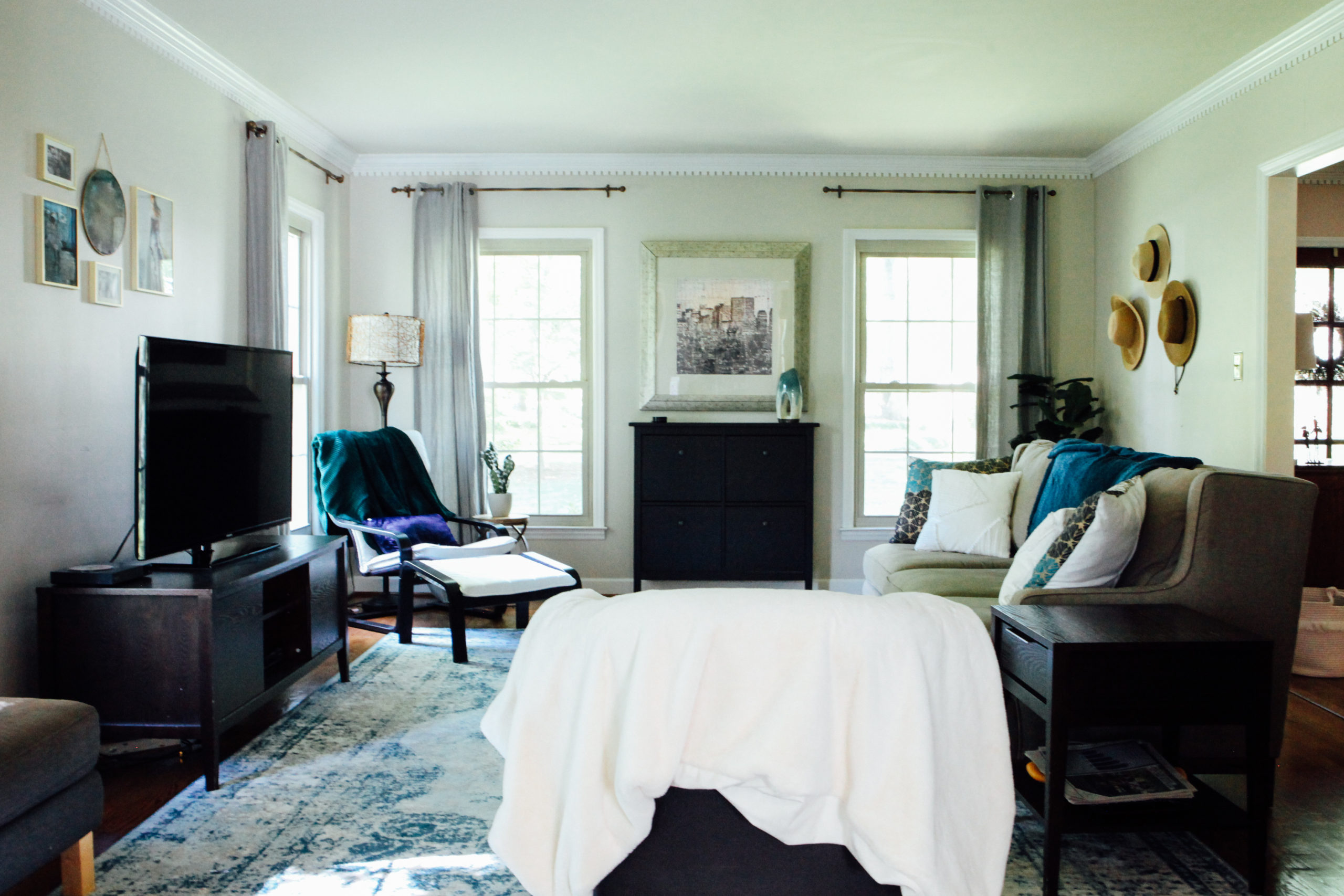
 Adventure awaits- at least it feels this way in my living room. I wanted to do a simple refresh without updating any furniture other than my coffee table (because money ya’ll!). We’ve had most of these neutral pieces since before the kids were born and did not want to replace the furniture until they’re older so I was forced to get creative.
Sometimes the best inspiration strikes in the most simple form. In this case, a beautiful coffee mug that was gifted to me by a dear friend. One day I sipping on my morning coffee and all of a sudden I realized the colors on it were the perfect springboard for our new color palette. The gorgeous deep greens, teals and gold just leaped out at me. I’ve been searching for little things in those tones ever since.
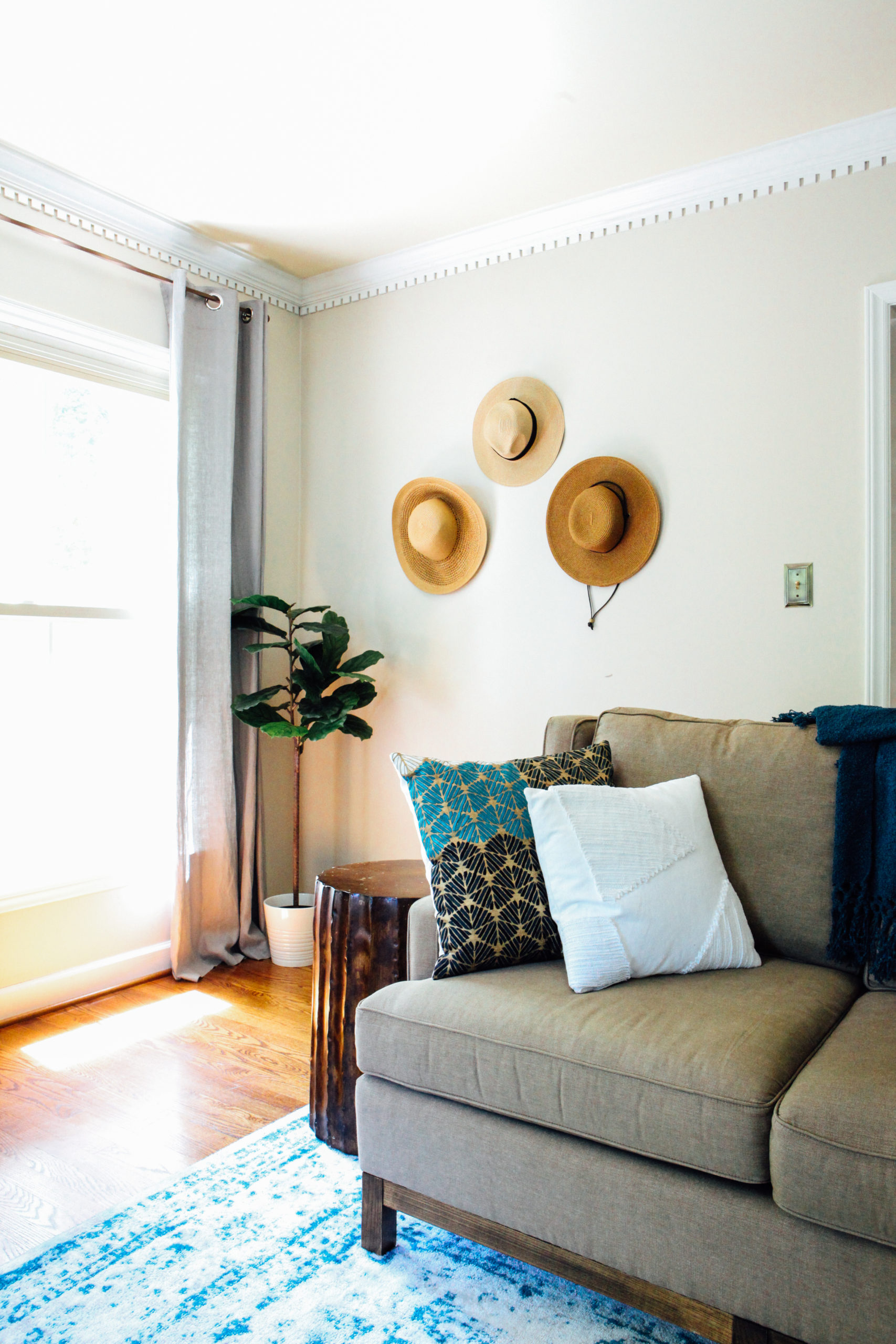
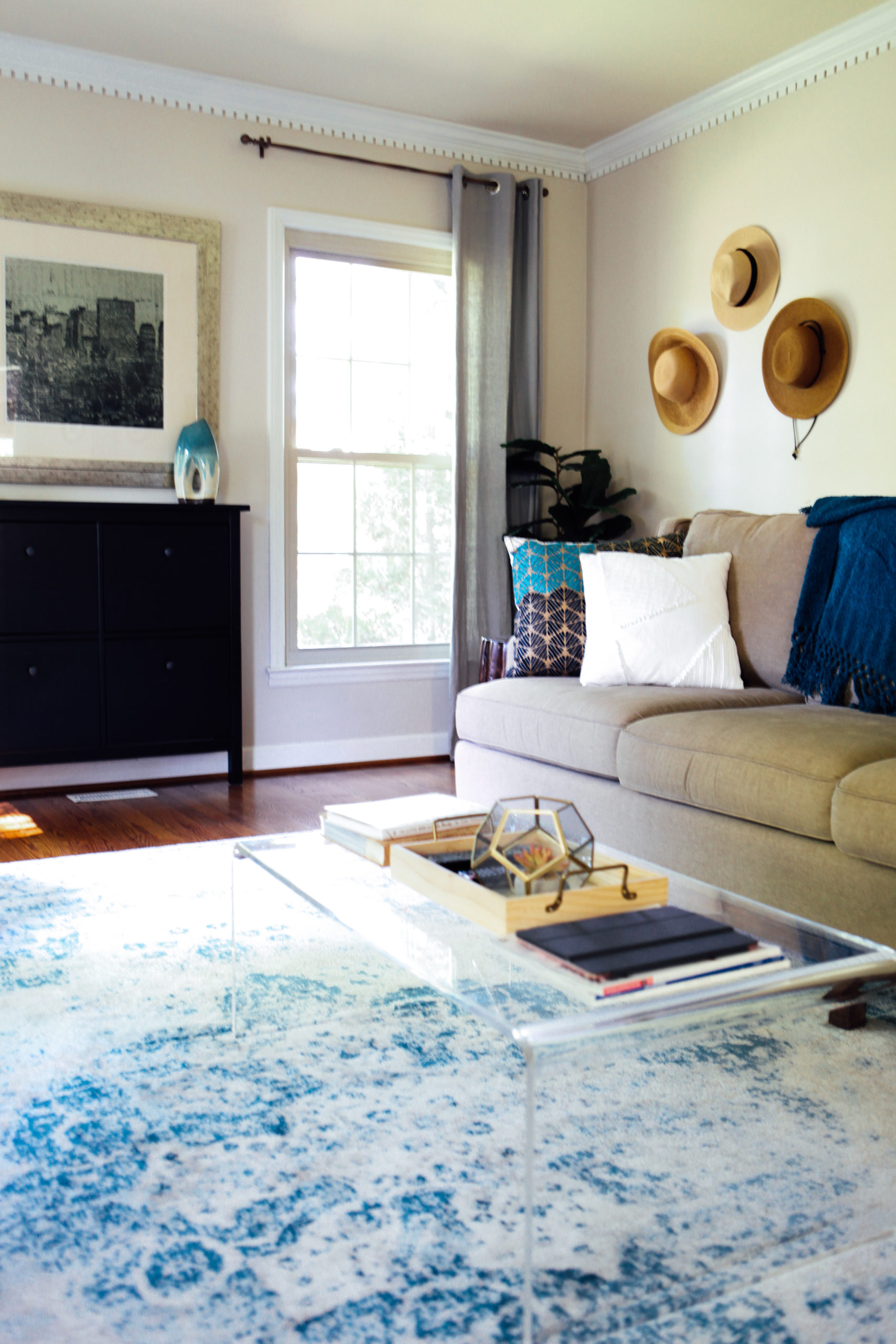
It amazes me how the smallest details can have the biggest impact. My living room feels completely different then it did 3 months ago. Exhibit A: awkward wall I had no idea what to do with became a place to display my favorite hats. This simple idea is both functional and beautiful and inspires me every time I walk in the room.
If you don’t even know where to begin or what you really like, some interior designers encourage you to stop and look in your closet. See what the themes are: they could be preppy, boho, classic, minimal, or have bold prints. It’s likely that your taste in home design will be similar to your style of clothes. This may help you at least narrow your category of design down. Who knows, you may just discover that you don’t actually love the farmhouse look but Pinterest made you do it. The more you’re able to identify your own personal style the easier it will be to decorate a home that clearly reflects you.
Still stumped? Go to your favorite store and see what inspires you. In my case, it’s Anthropologie because everything in there lifts my moods and immediately gets my creative juices flowing. Go to the place that does that for you. Perhaps you find inspiration in a dress, a piece of art, flowers, or a mug. If you truly love the color tones represented use them to get you started and go from there. The important part is to nail down the color scheme first, choose a theme and stick to it. In my (little) experience, if you follow that rule it should all come together in harmony.
I’ve linked the sources for all the fun details below. If you have any questions let me know in the comments.
Sources
Chained Prisma Mirror from Anthropologie
Ikea Green Throw – as seen over white Poang Armchair
Print of Teil Duncan’s Flowing Dresses
Teal Throw from Target’s Opalhouse Collection
Acrylic Coffee Table from World Market – Currently on sale for $230 and $100 off
Thanks for stopping by.


Be the first to comment